Toke
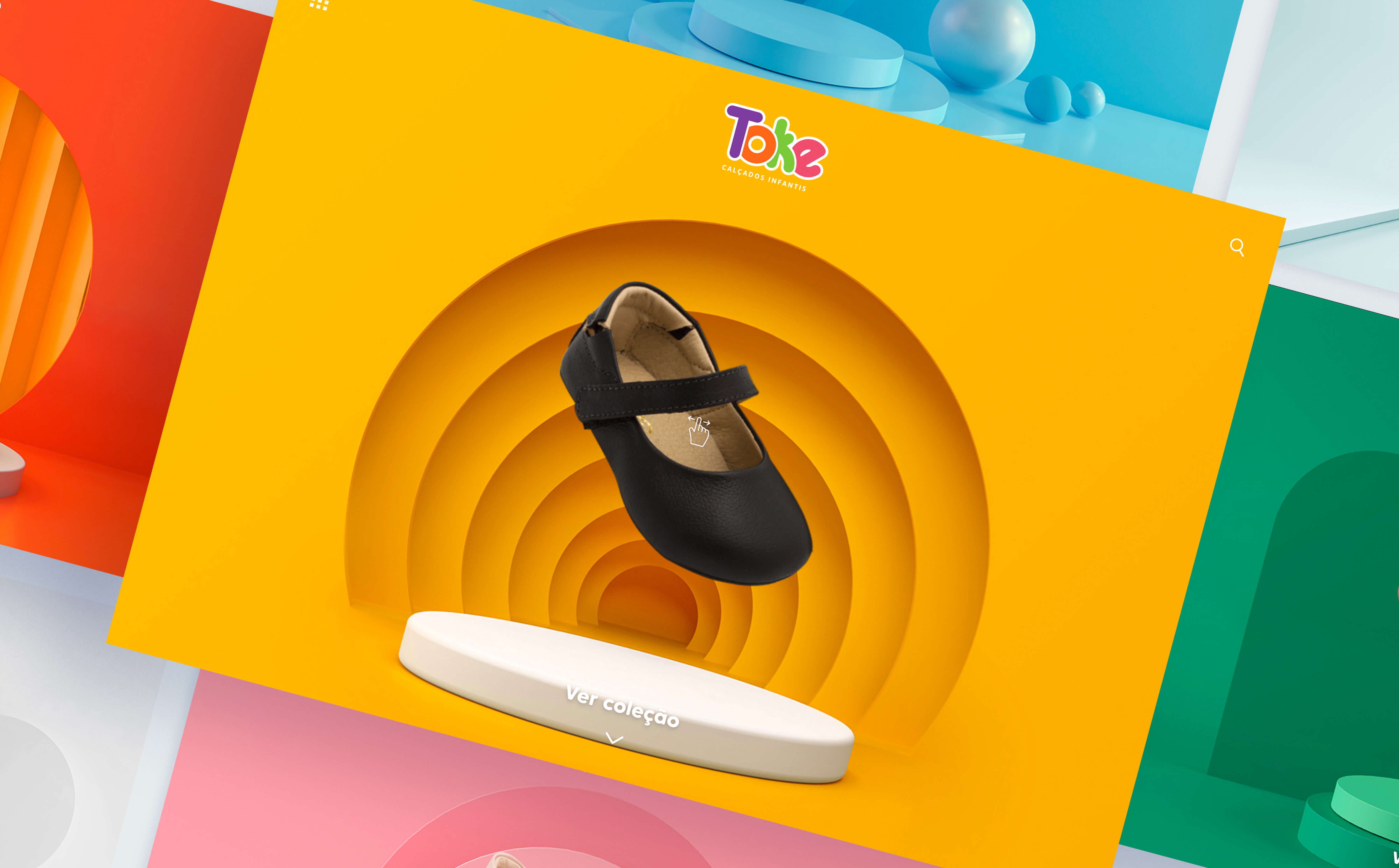
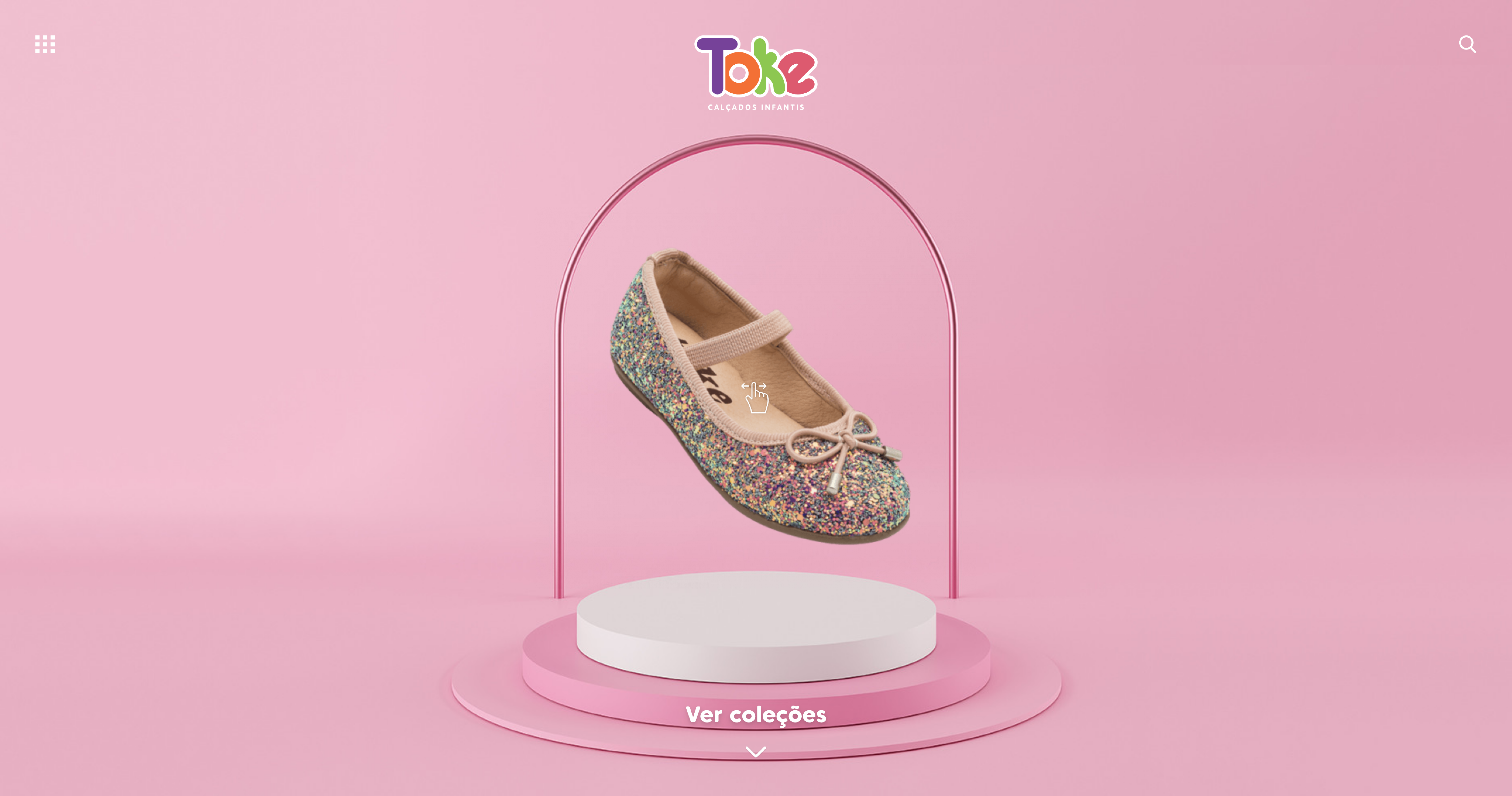
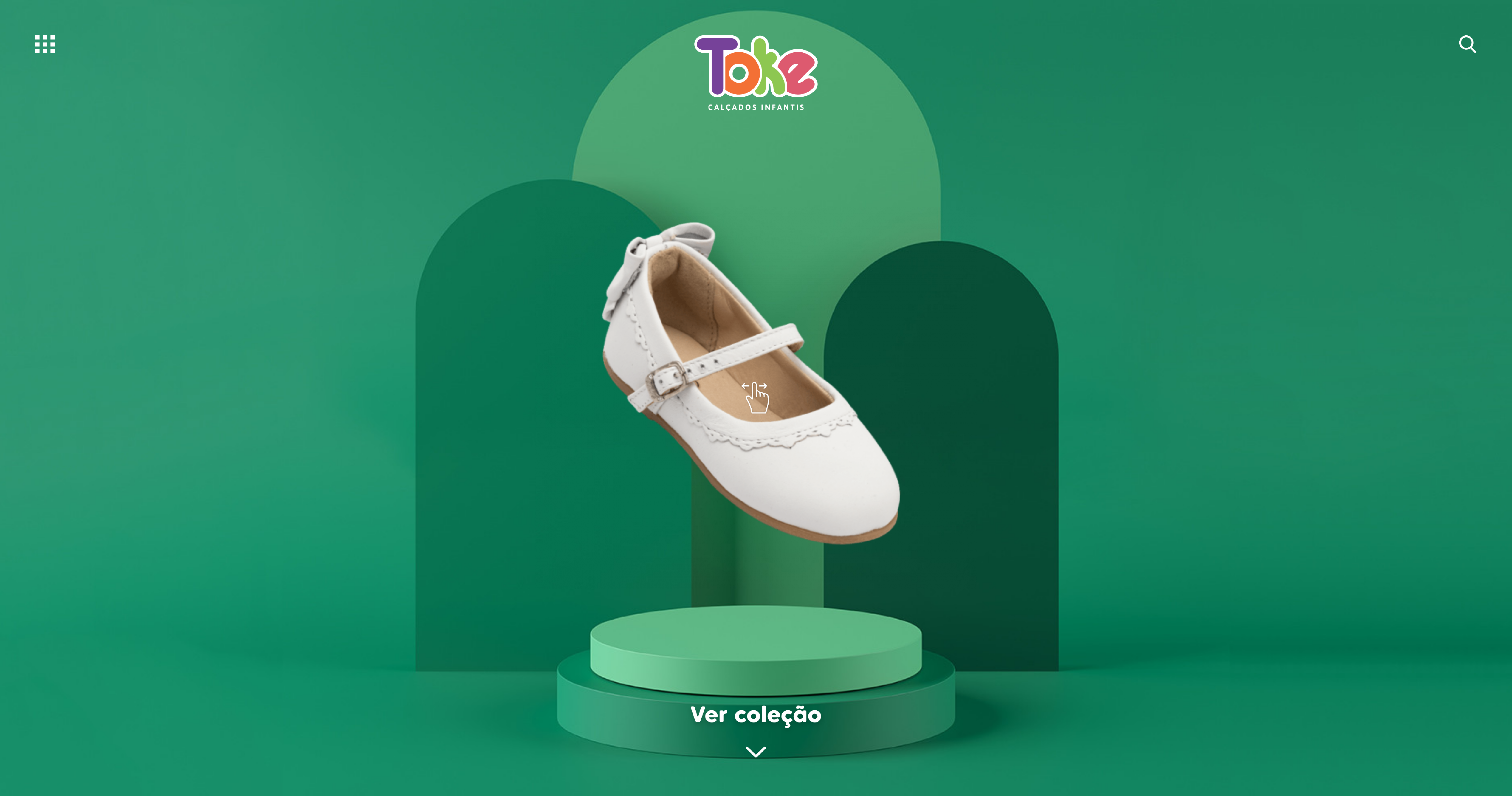
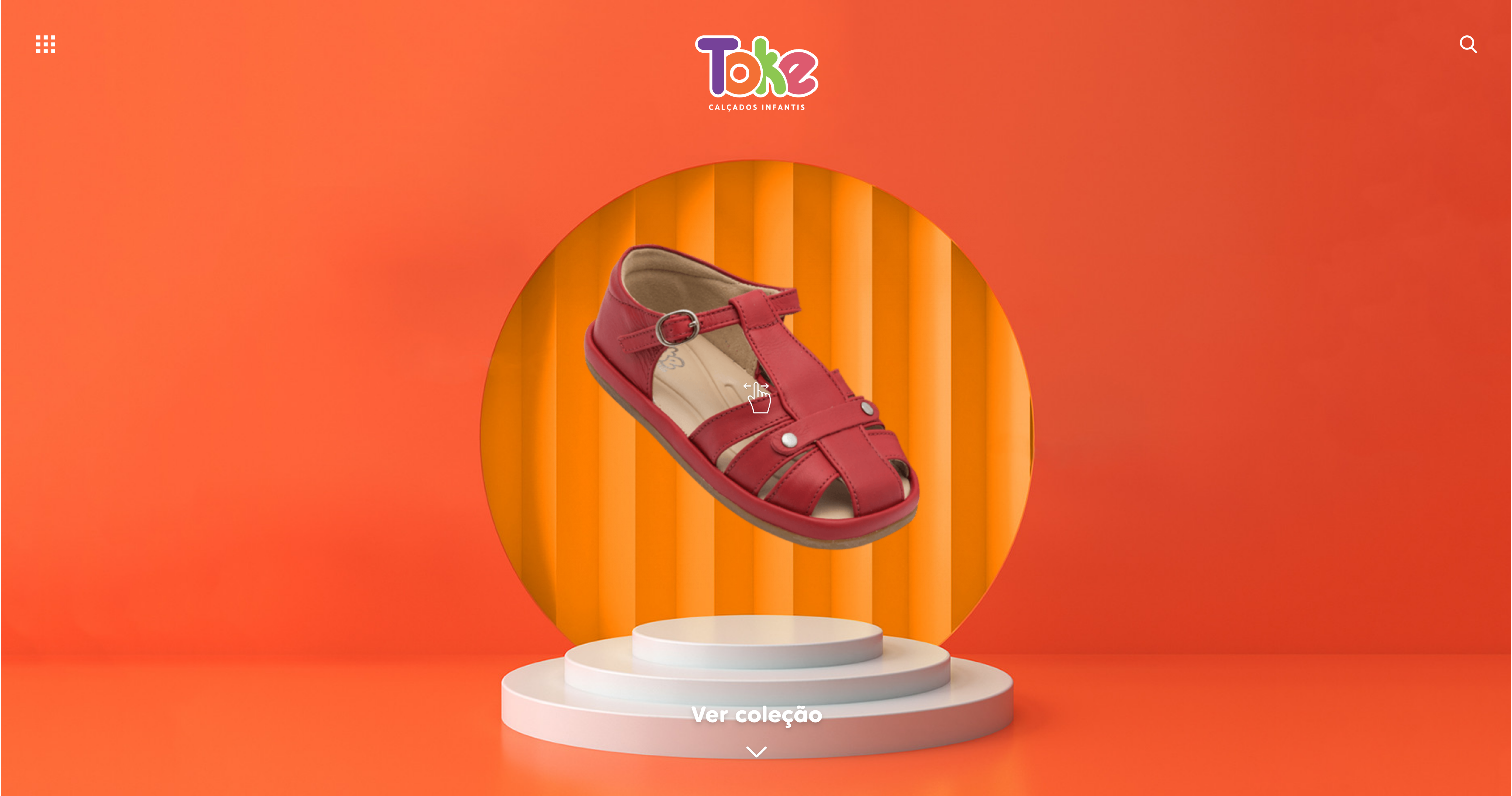
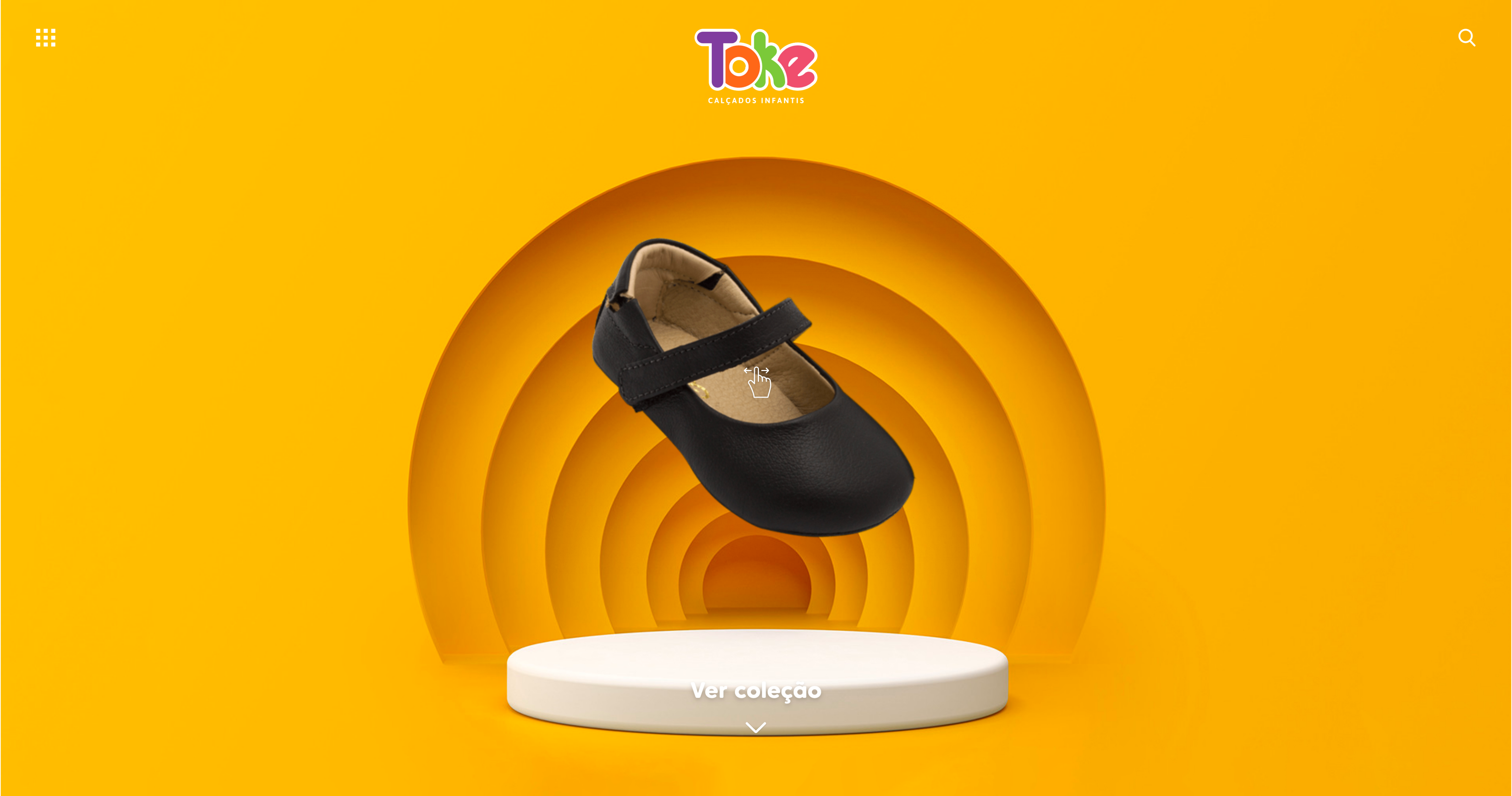
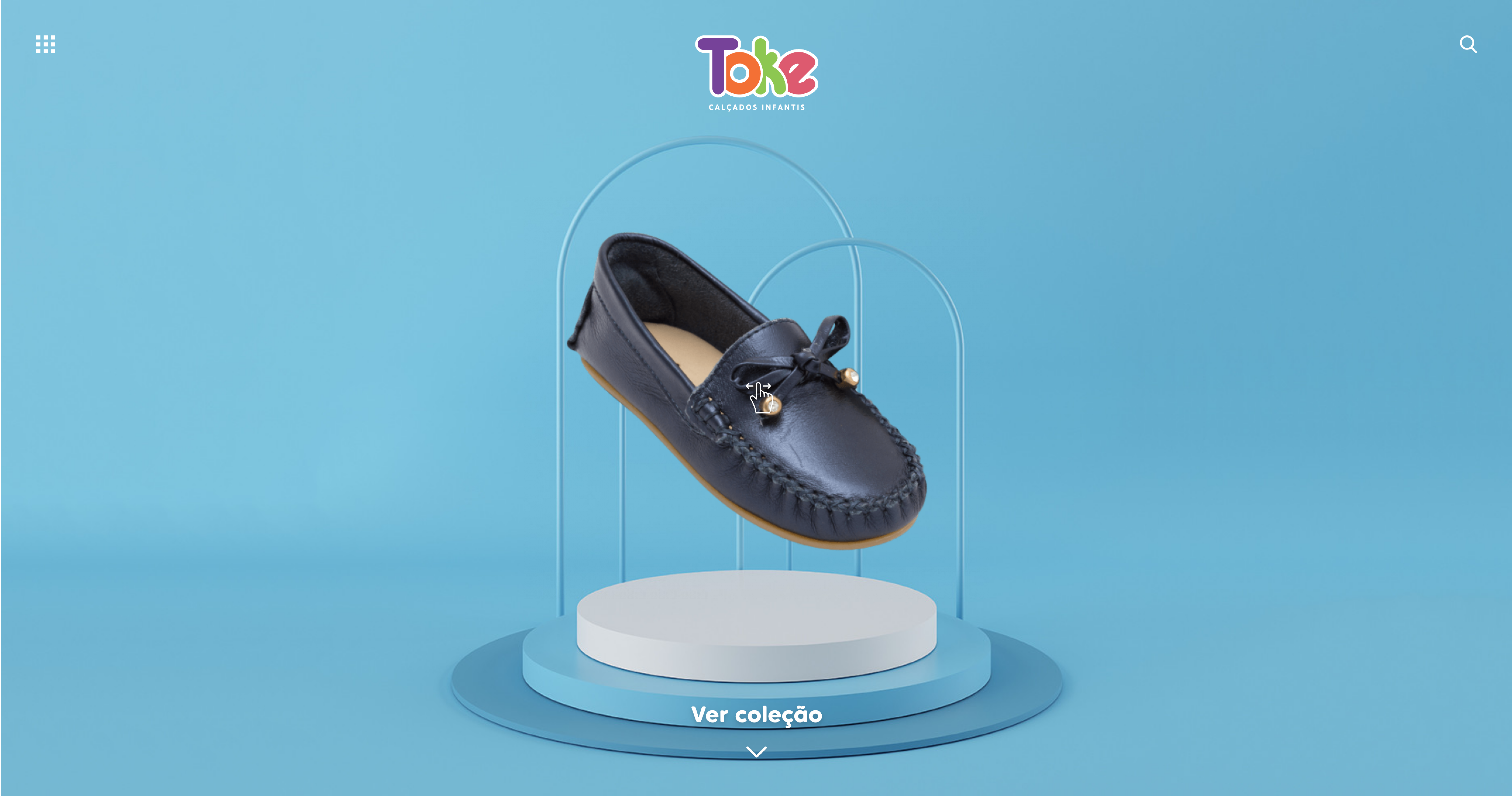
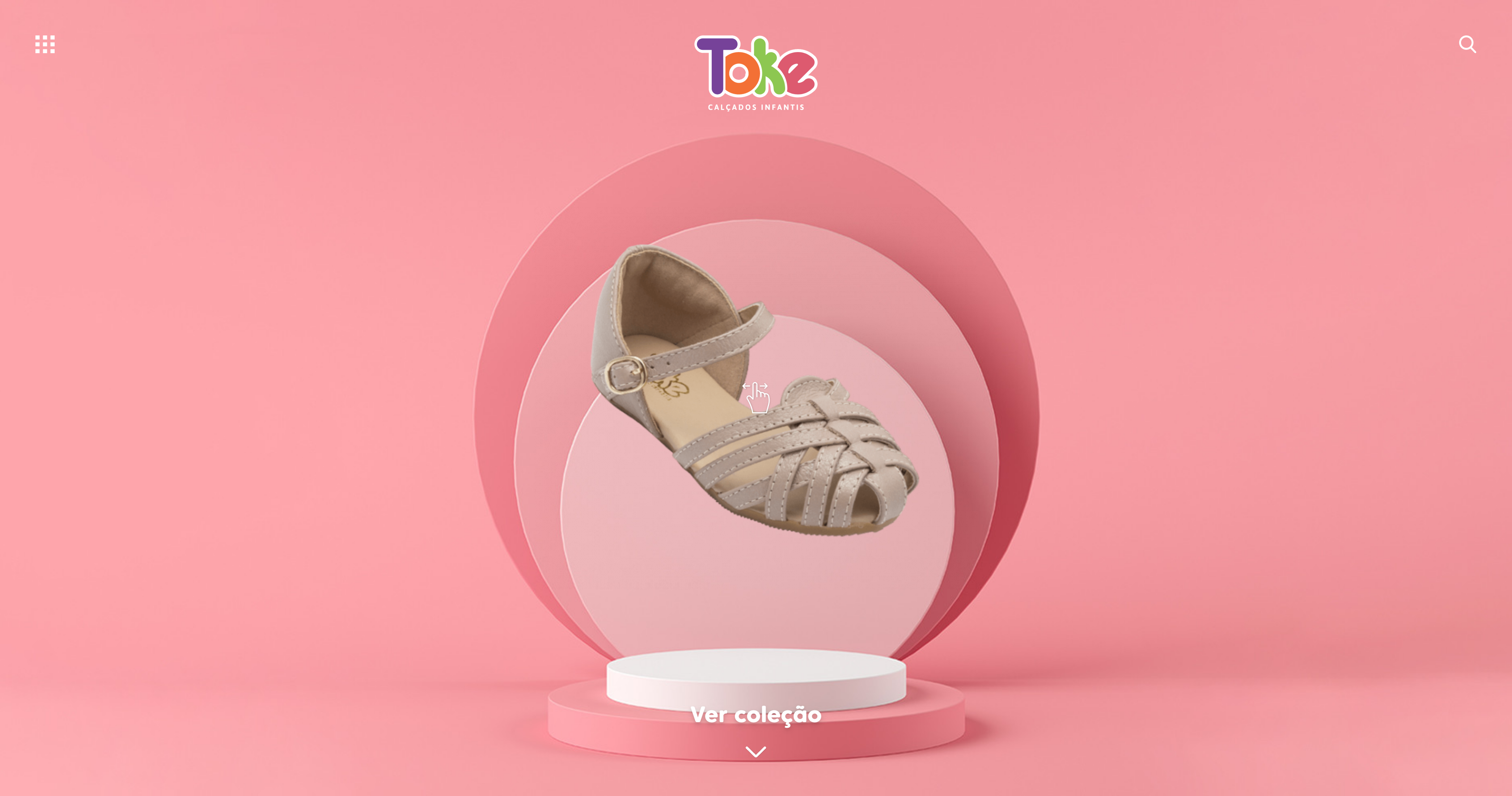
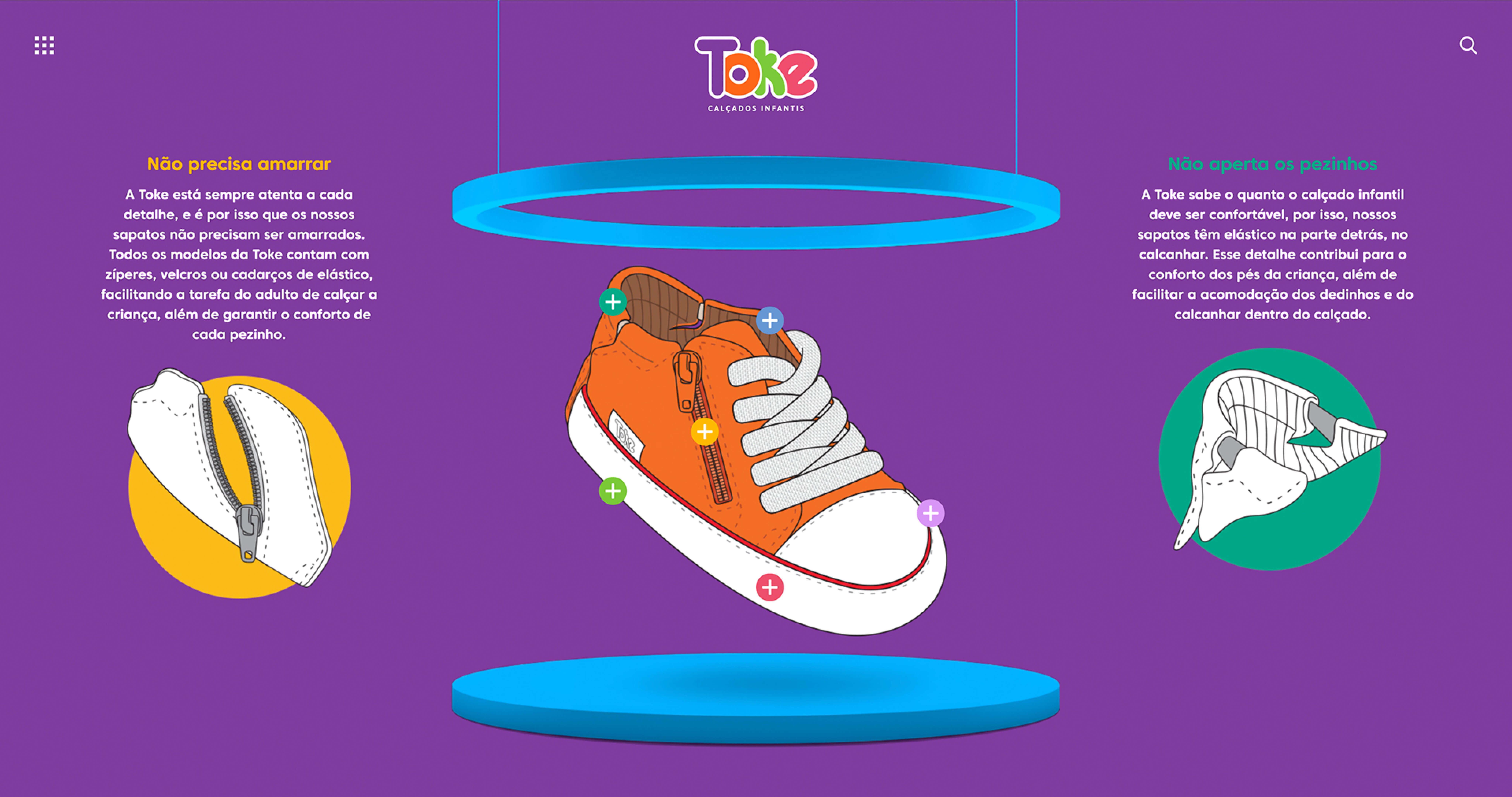
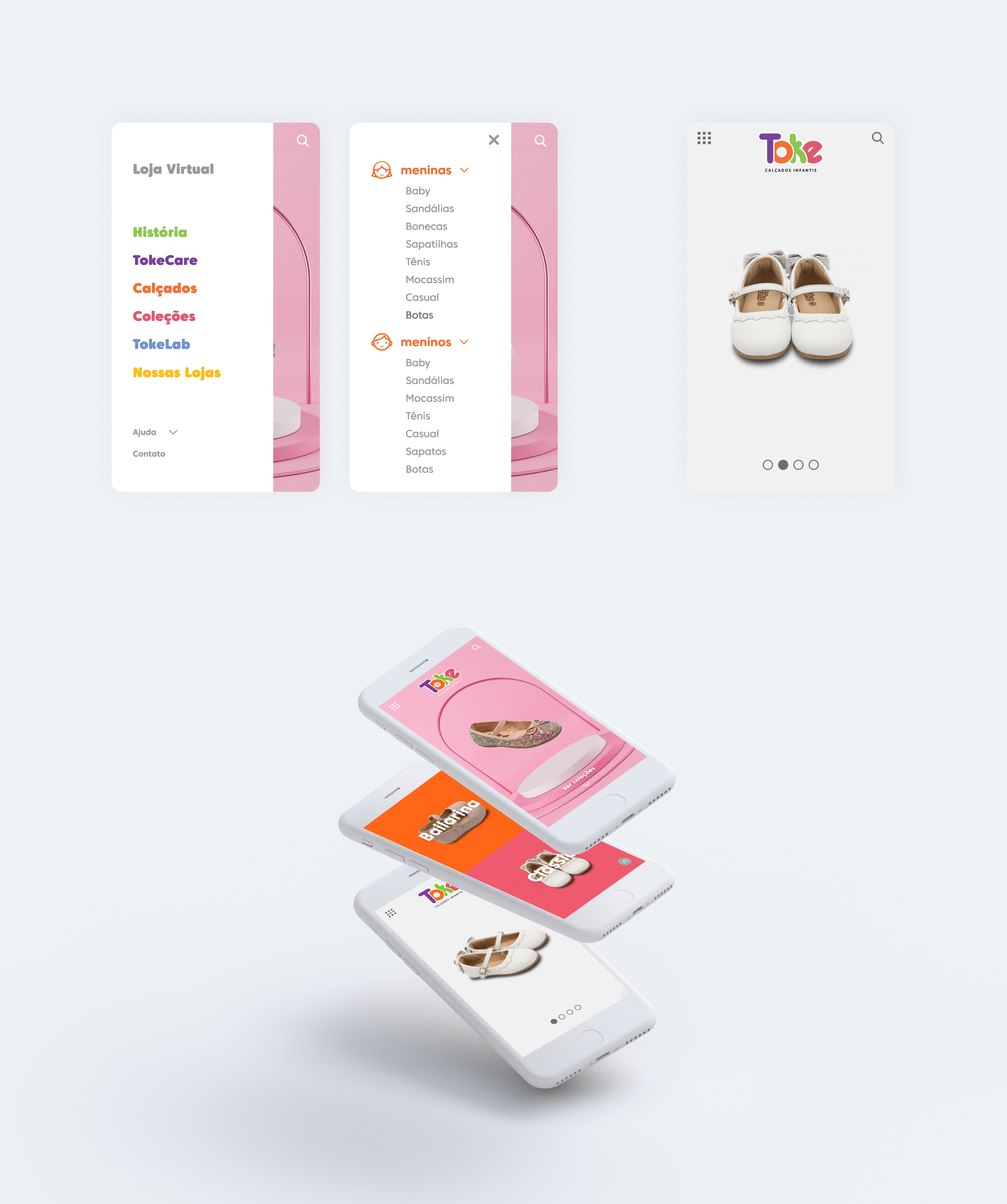
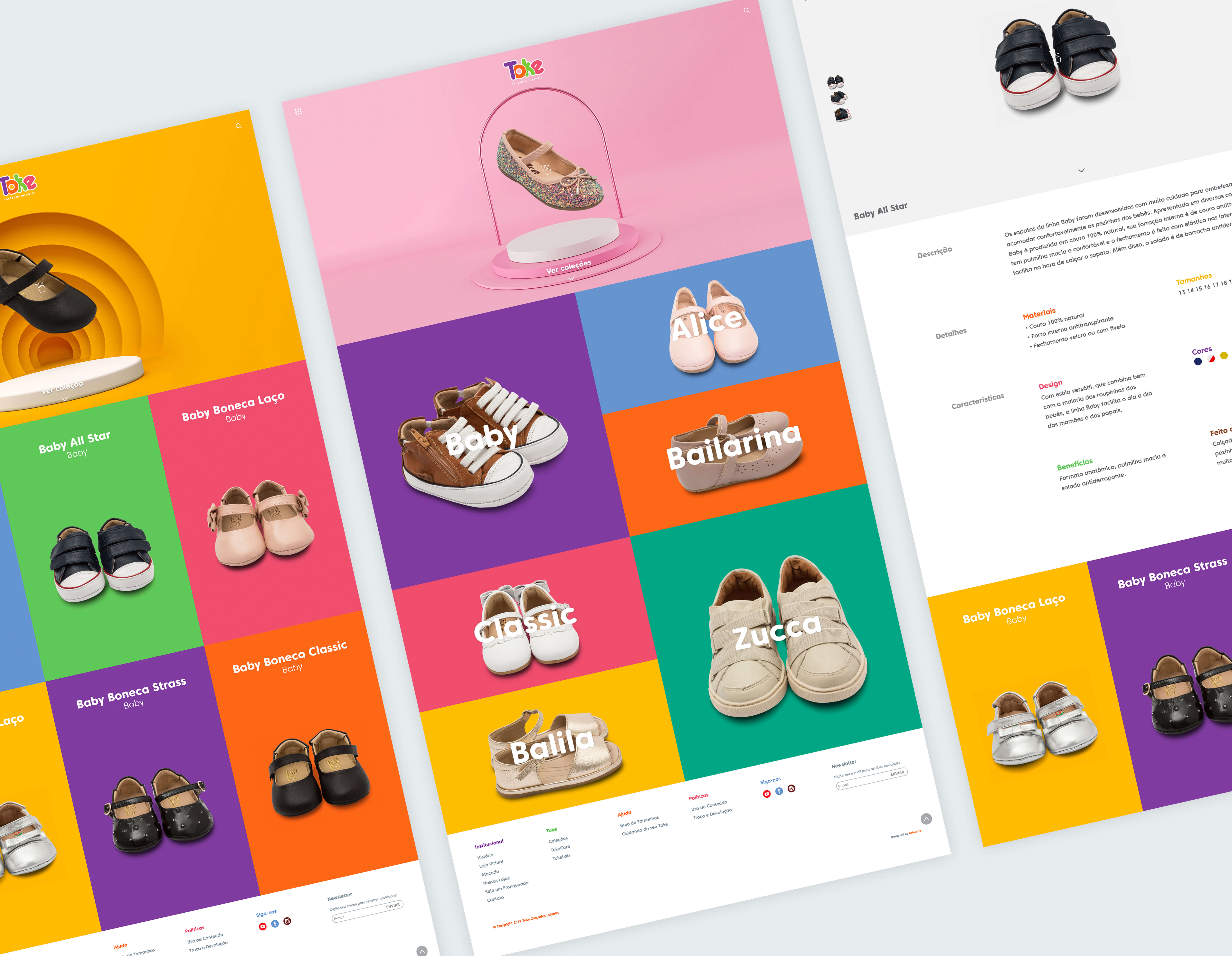
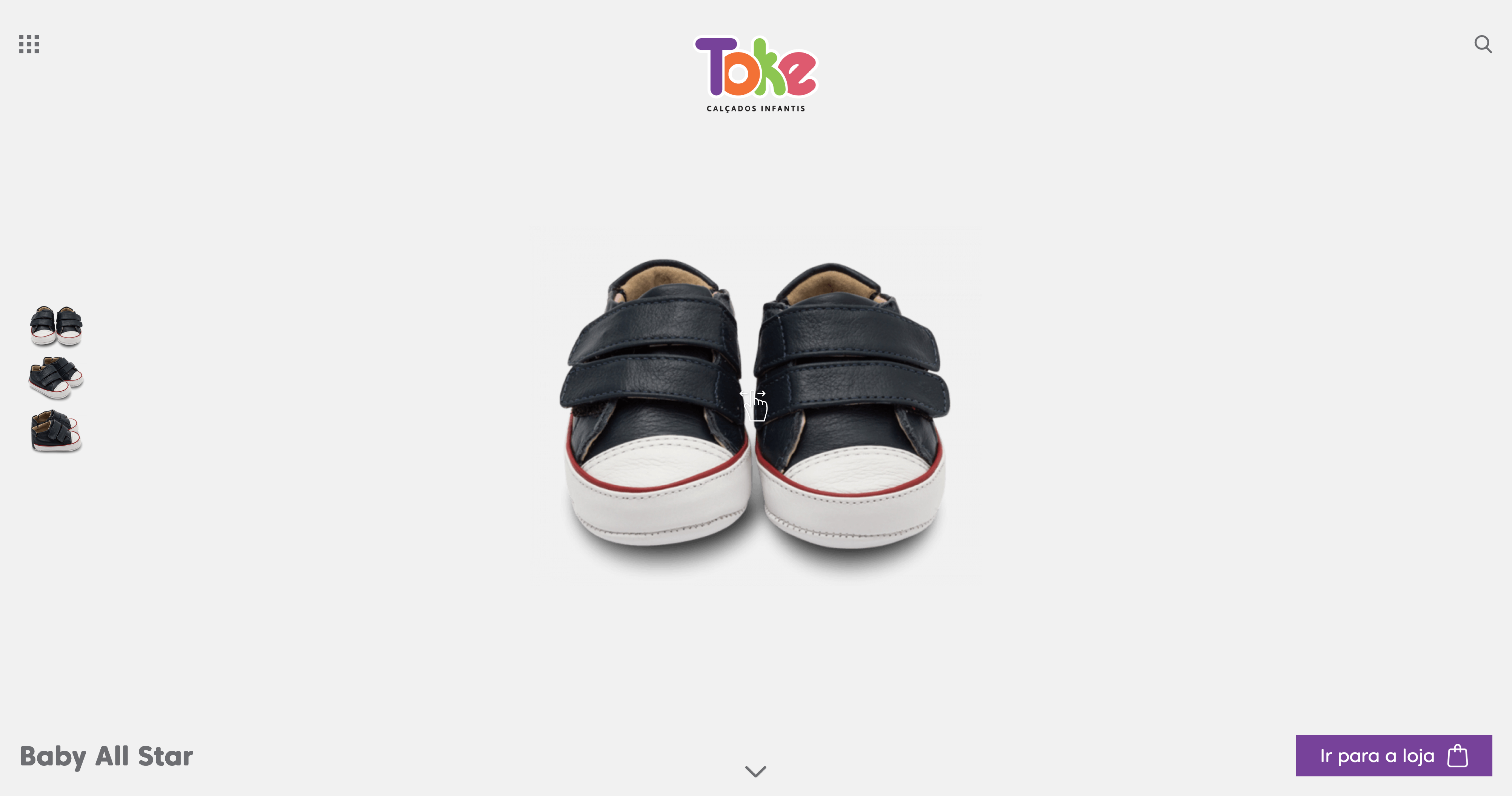
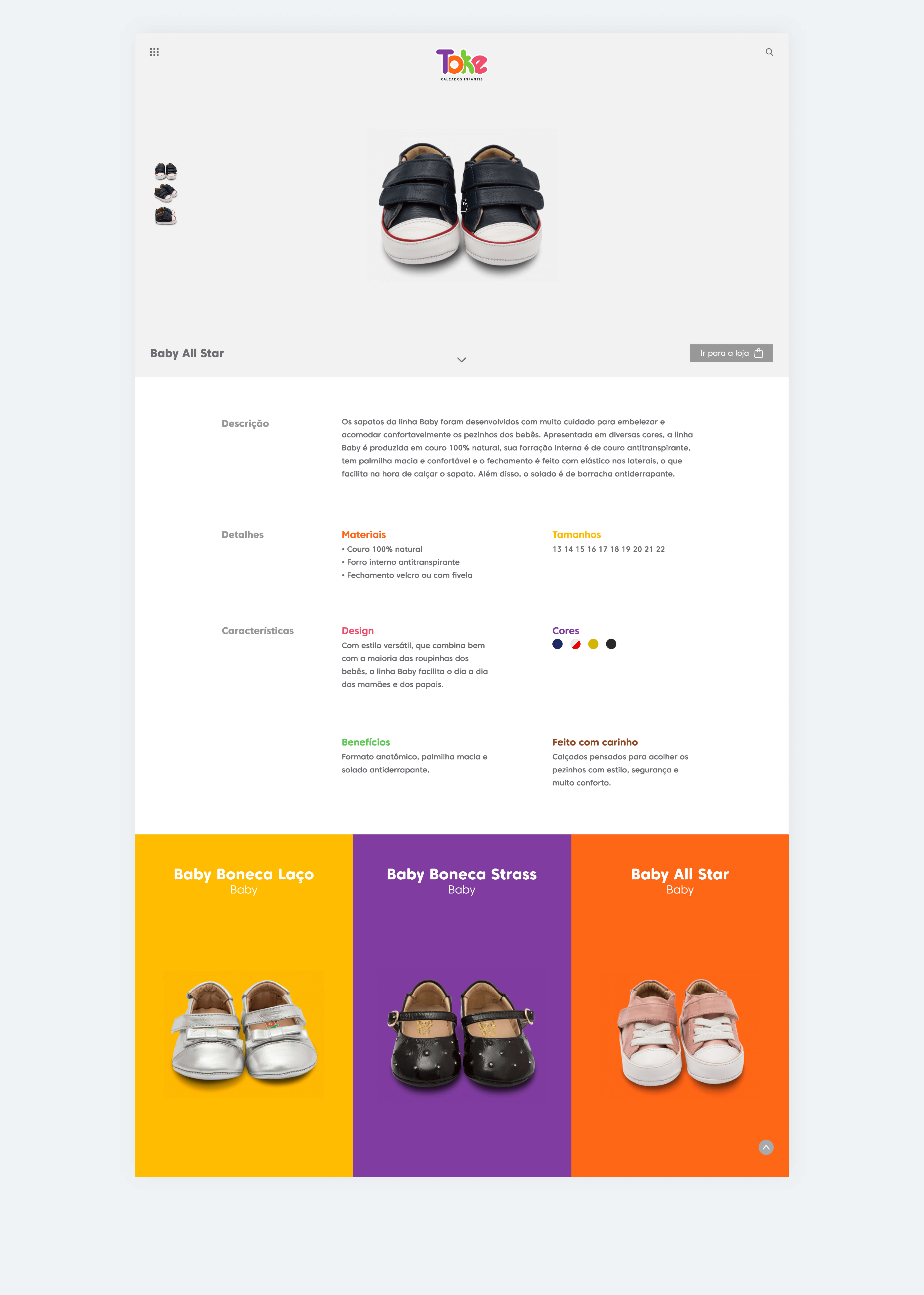
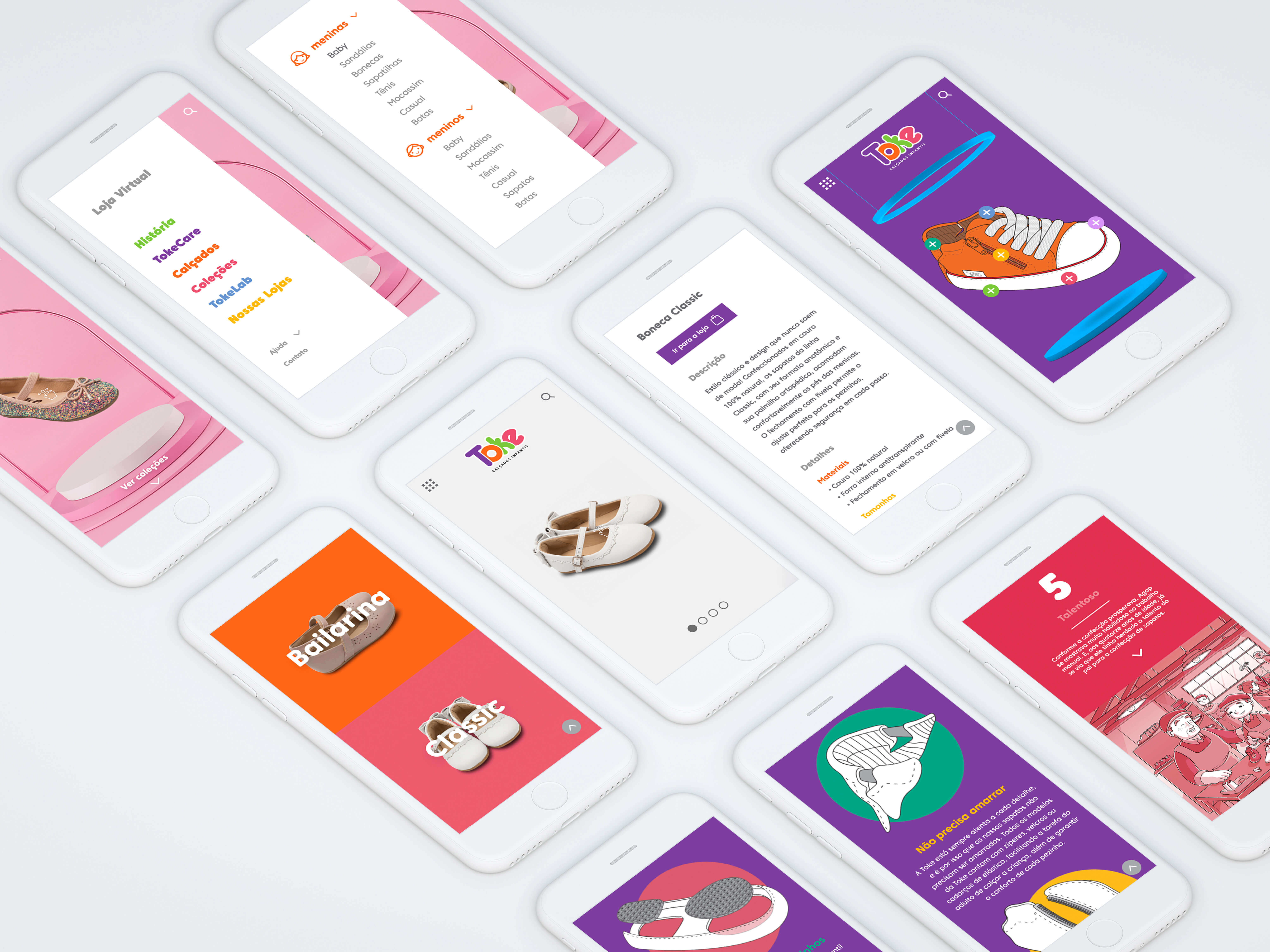
The website was created in a playful, minimalist and modern using the Toke's brand leaving its self-made shoes in the spotlight.
| CLIENT | Toke Calçados |
| YEAR | 2022 |
| WORKS | UI/UX, Website, Digital |
| LOCATION | BRAZIL |
| AWARDS | Latin American Design, Awwwards, Css Winer, Brasil Design Award, Peru Design Biennia |



TOKE CALÇADOS
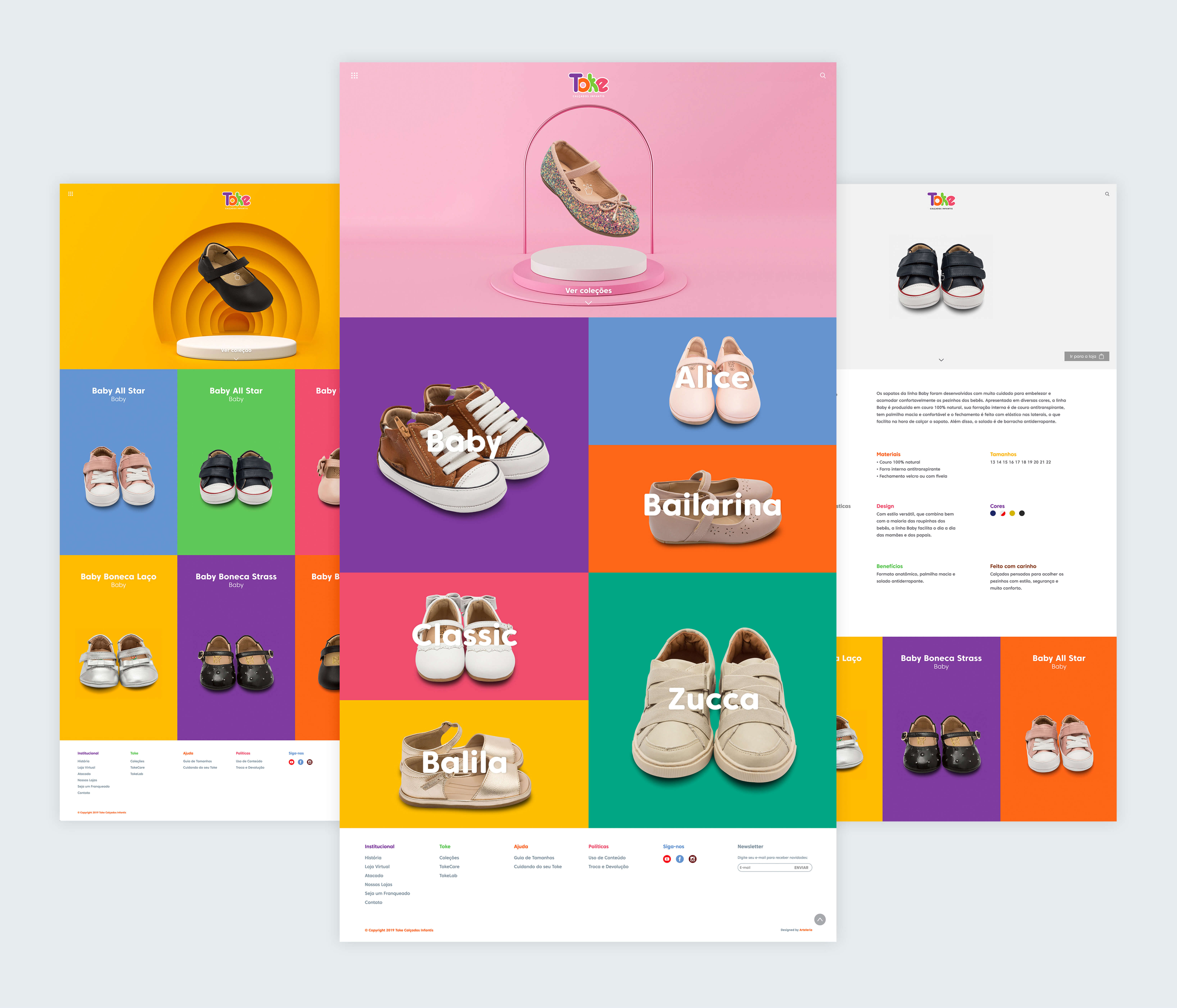
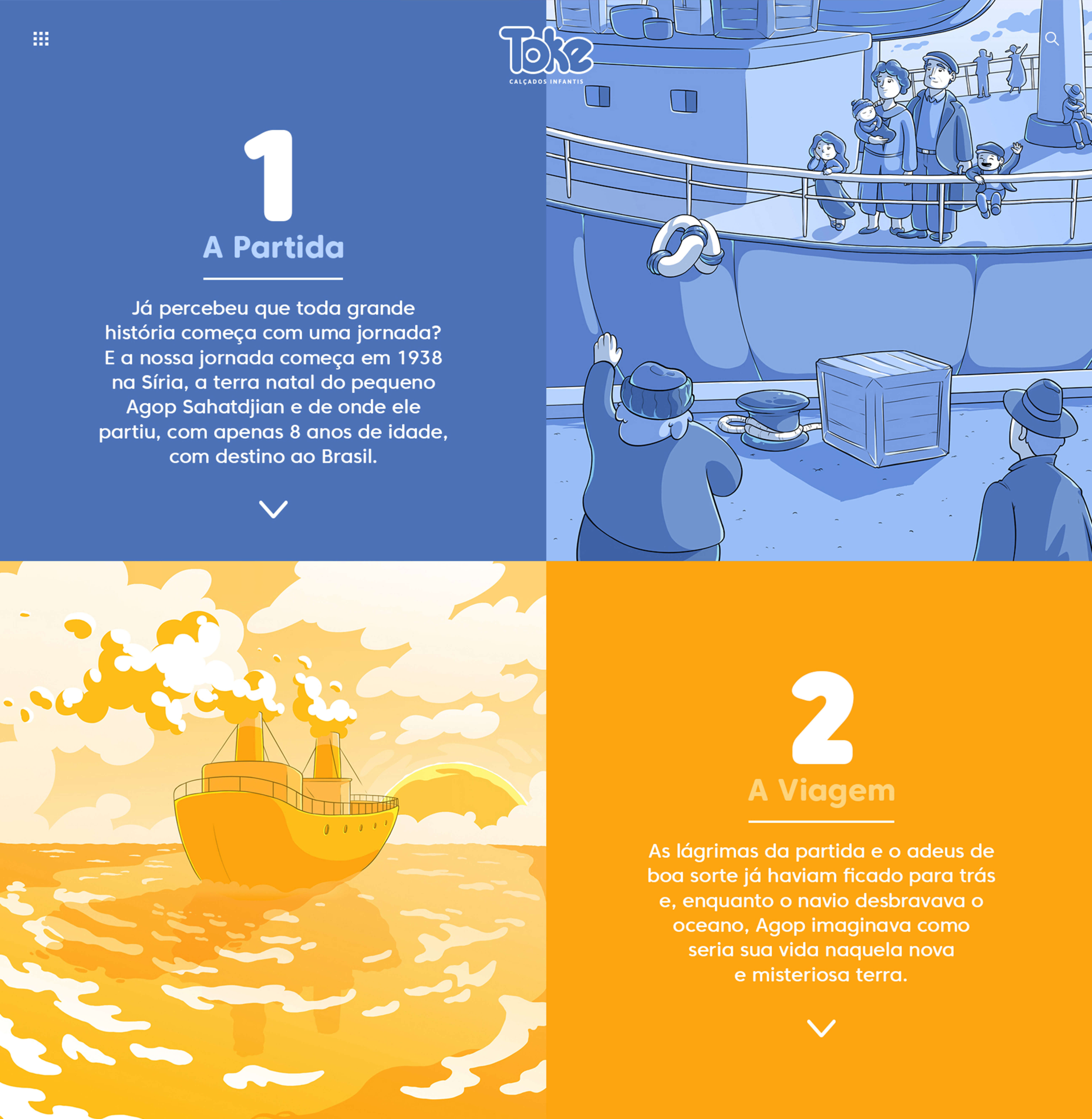
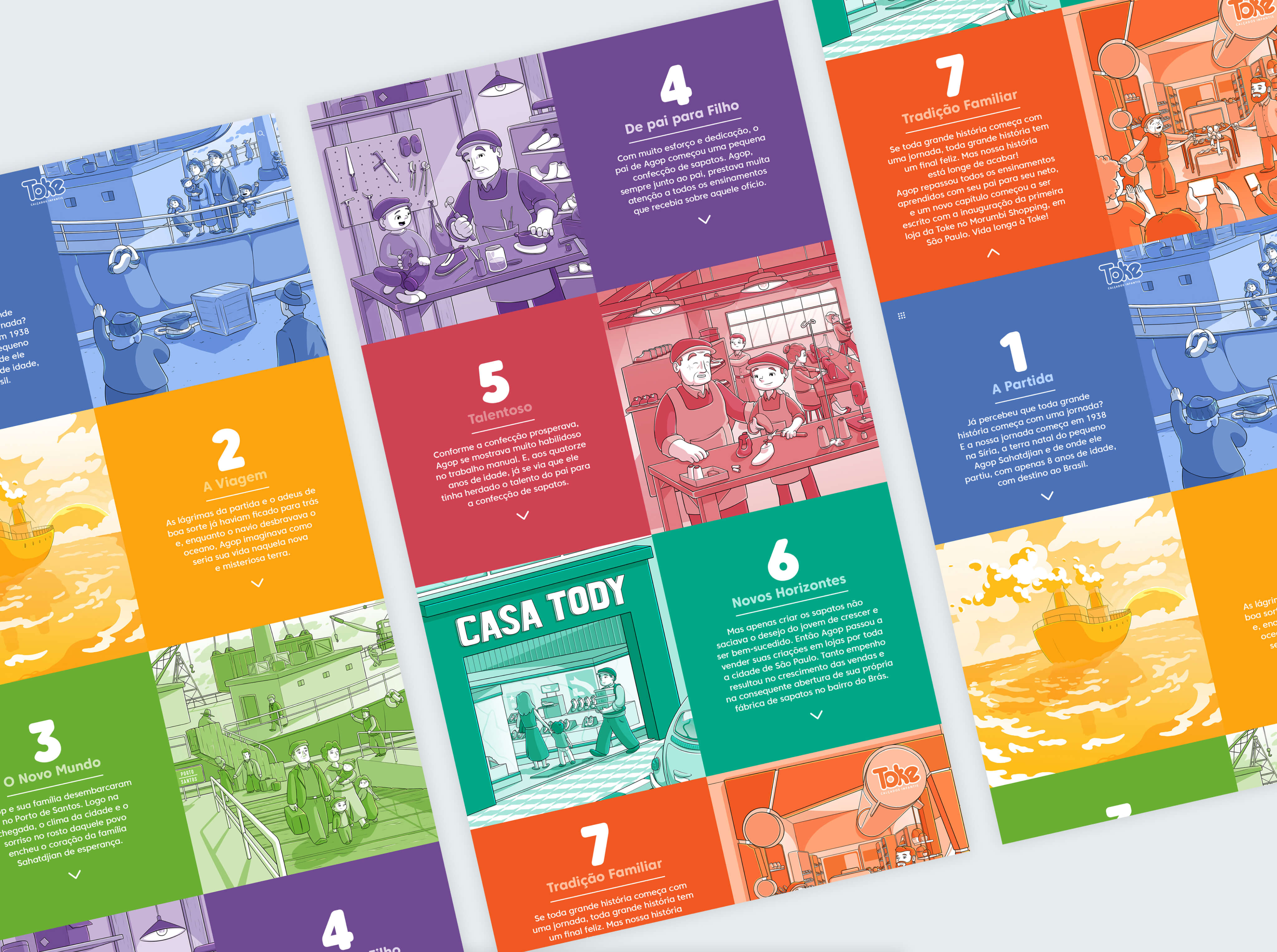
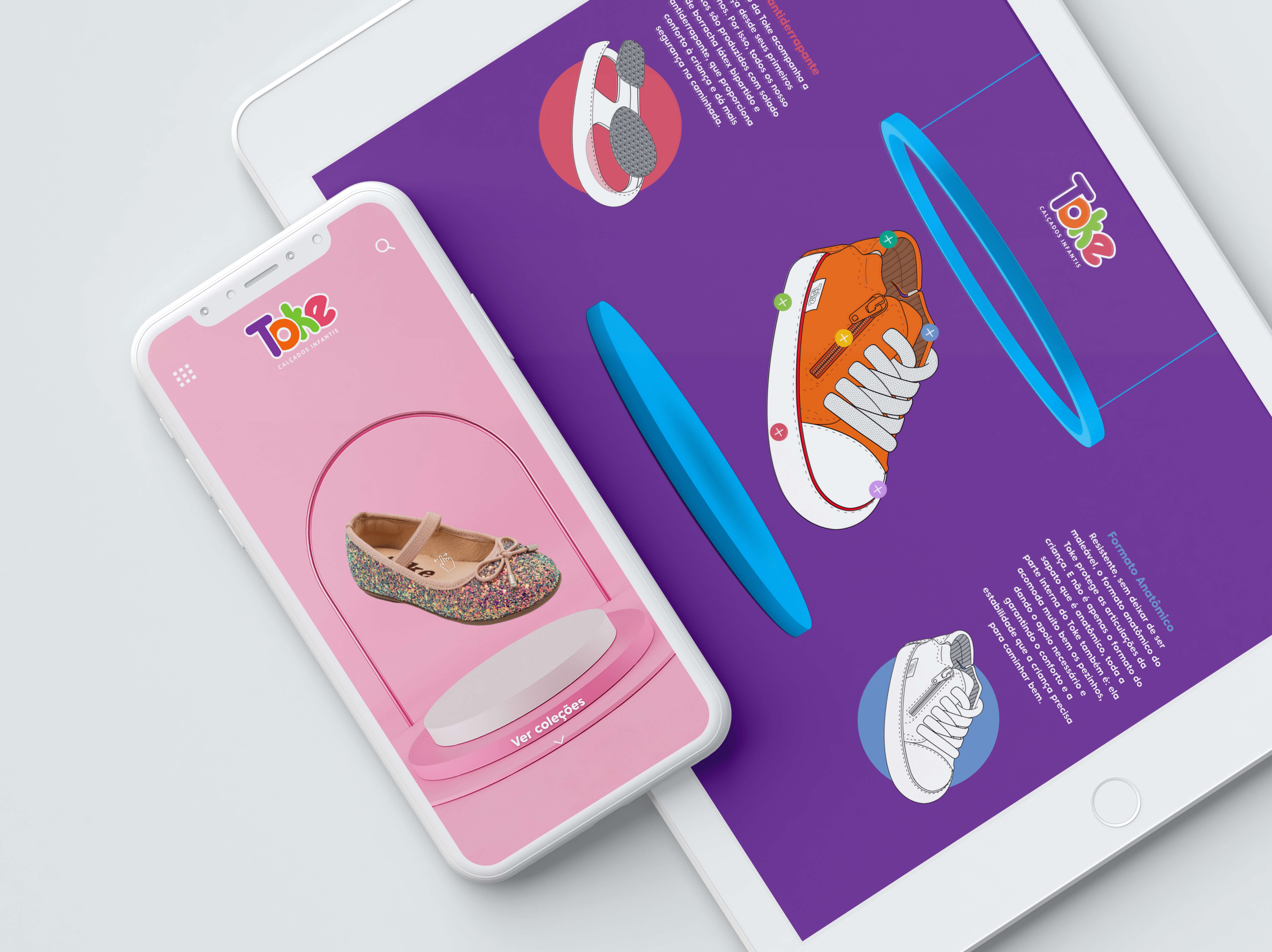
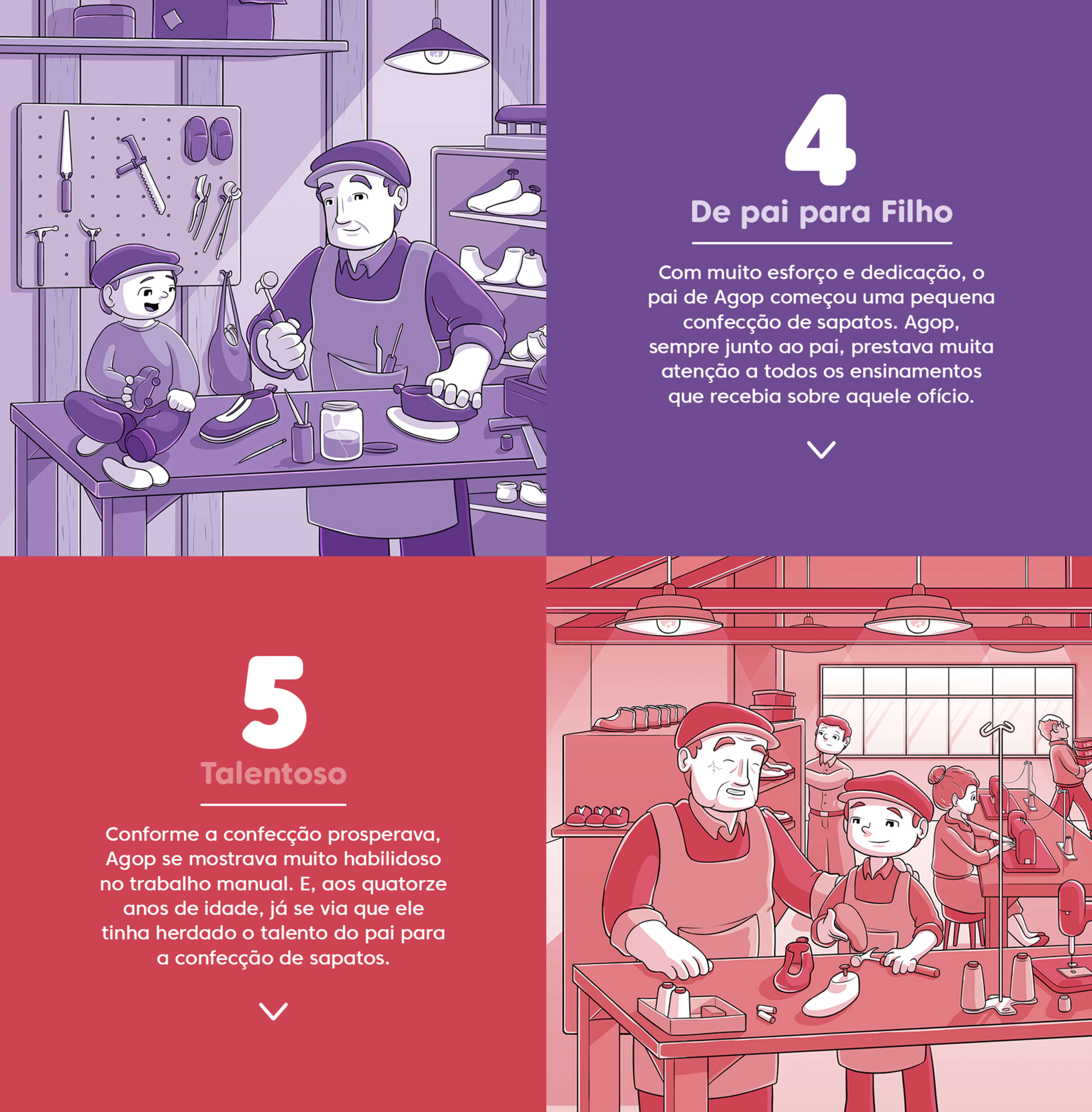
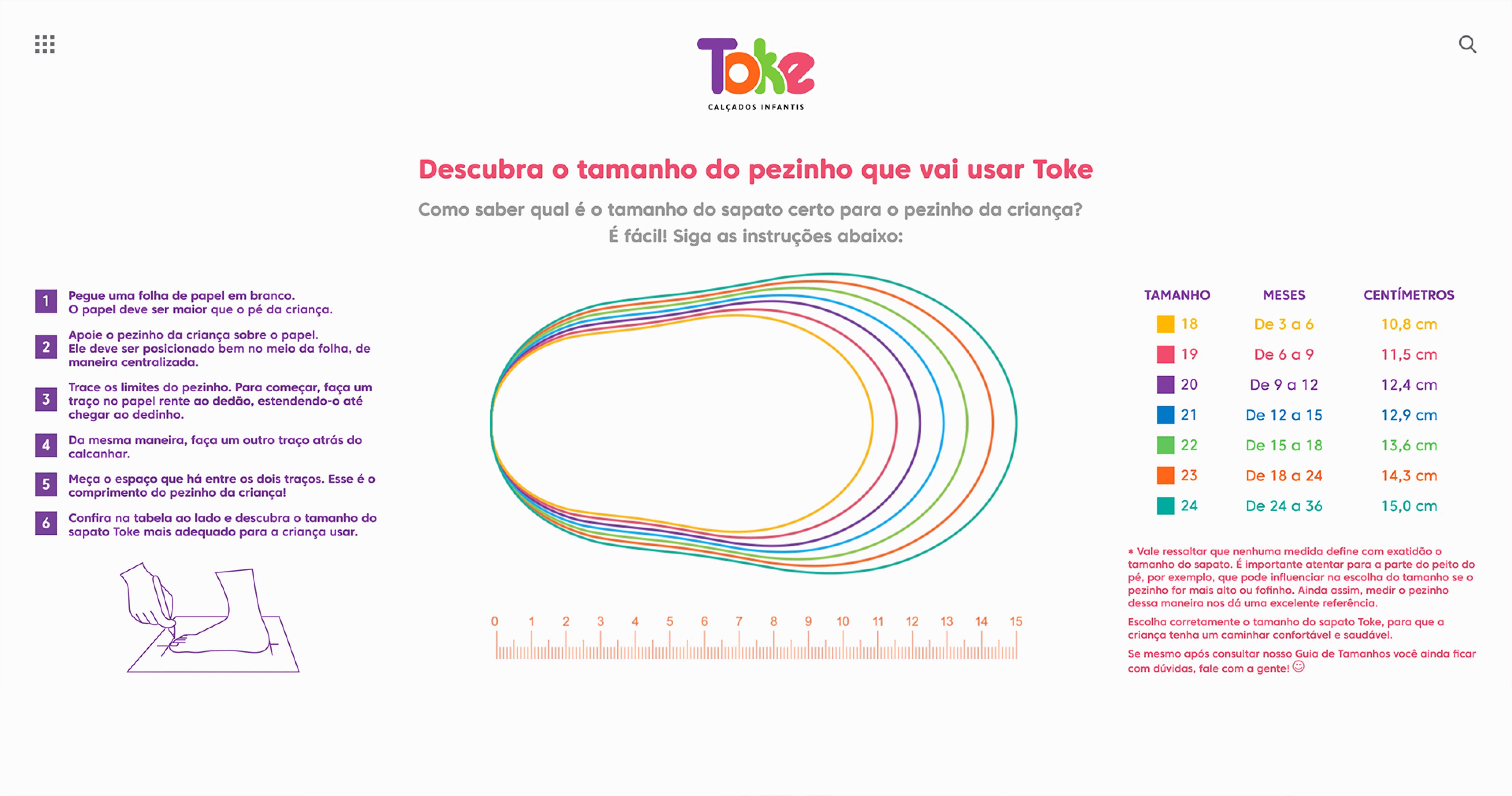
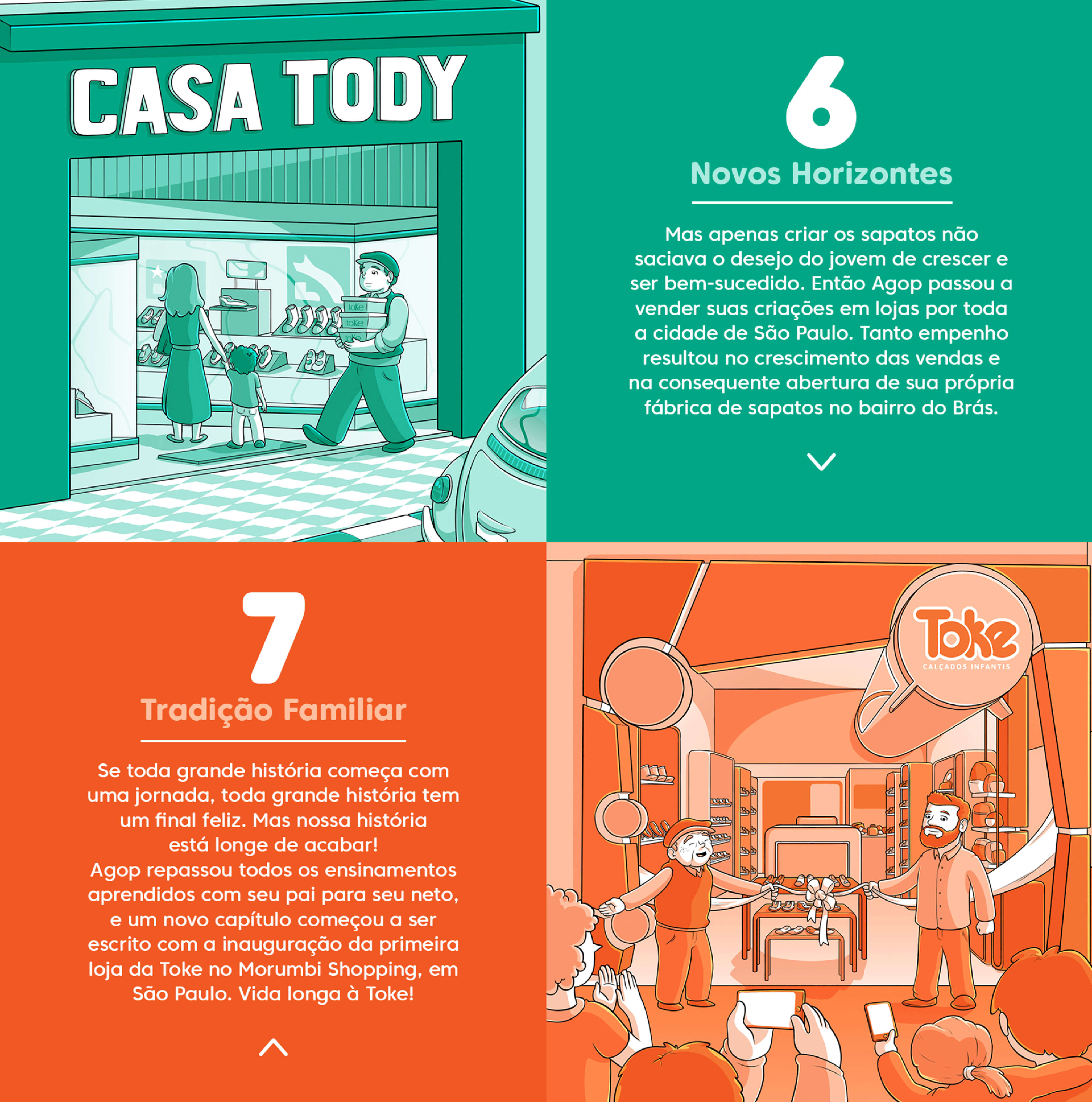
The design of Toke's institutional website meets the children's universe in a playful, modern and cheerful way to introduce the brand to future customers and partners. The site works with the abundance of vibrant colors of Toke's identity in a minimalist setting, leaving its self-made shoes in the spotlight. The new website is an important part of the brand's expansion process, so developing its concept required embracing the joy and lightness of children with Toke's safety and tradition. The navigability and design of each page of the site reflect the care and affection that Toke has with children's feet when designing their products.
Credits
| Agency/Studio | Arteleria |
| UX/UI | Túlio Grandi |
| Development | Fagner Vieira |
| Illustration | Rodrigo de Freitas |
| Art Direction | Túlio Grandi |

